What Is Responsive Website Design? (It’s Okay If That Sounds Like a Foreign Language)
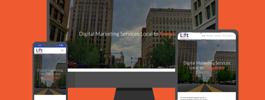
It doesn’t take a web development guru (but we have those, too) to realize that the way consumers access the internet has evolved. People are hitting the web more than just at their home computers, so responsive website design was born. Responsive web design addresses that reality by displaying web pages in a way that makes them adaptive to different devices with different screen sizes.
More Than Just Desktop
It’s been a while since the home computer became popular in the 80s. Now fast forward to today, where researchers determined that 60% of Google searches come from mobile devices. Plus, people are making purchases on their mobile phones more than any other portable tech. However, statistics show that shopping carts using desktops are 24% bigger than on Smartphones. On tablets, they were 14% bigger. These are important factors to consider on an ecommerce site. You want a usable mobile version of your site for the ones that want to buy quickly but still have a great user experience on a desktop for the ones who want to bulk up their cart.
Not surprisingly, companies want to drive business to their websites, keep customers interested and on the site, and offer ecommerce functionality for shoppers using smartphones, tablets, or desktop computers to explore content and buy products. This means that a website must look great and work great for mobile users as well as those on devices with larger screens. This takes into account screen resolutions, flexible images, viewport width, and usability (are users scrolling or clicking around?).
A Website Design Trifecta
We define the responsiveness of a website by the quality of three elements:
-
- Grids. A grid allows columns to display. The use of CSS (Cascading Style Sheets) makes it possible to let the columns automatically adjust to the screen size the customer uses. A flexible grid lets the site look good on a mobile screen or a large desktop monitor. The brand identity remains intact.
- Queries. A CSS media query makes web designs dependent on user device makeup. It creates a custom experience.
- Visuals. Images and rich media files are crucial to a good UX design, but they may need a resize based on where the user is visiting the site. Responsive images adjust their fit to the size of the screen and browser width.
It’s interesting to note that these elements are only the basic approach to making a responsive website. Today’s consumer is looking for more. No matter what type of device or browser window the customer uses to visit a website, it should load quickly, offer an engaging experience, and work with the settings the user has defined.
Search Engine Optimization
When you’re building a responsive website, search engine optimization (SEO) should always be top of mind. I mean, you do want people to actually see your site, right? Building out your site with SEO elements, to begin with, is key to showing up in the SERPs. This means including an alt tag for every image, labeling headers properly (which include keywords), and making sure all your technical data is up to snuff.
Flexibility Is Key to Responsiveness
While discussing website design, one term repeatedly comes up: flexibility. The more site elements incorporate flexible designs, the easier it is for a customer to visit the site and get a full experience. The site automatically adjusts to the size of the screen and its limitations. Most importantly, the elements work together without breaking the layouts. Sure, columns might be significantly narrower or spaced differently, but the site’s overall feel doesn’t change. Fluid grid layouts allow you to create different column layouts based on where the user is viewing, from smaller screens to large displays.
The concept is easy to understand. If you have a CTA button on your site, it’s going to need a resize based on the size of the screen it’s viewed on. You don’t want the whole button taking up the entire screen or getting cut off or conversely, being so small on the desktop that you can barely see it.
Mobile-First Design
When building your website, think about who is visiting your site and when. What percentage of users are using their phones compared to their desktops? If you expect the majority of your visitors to be mobile users, then design with mobile in mind first. It’s much easier to make a mobile-friendly website at the beginning than to condense a wider framework into a narrow screen.
A lot of mobile-friendly websites use a single-column template, but it would look pretty bad on a full-fledged desktop monitor. The mobile-first design takes the fact that users are scrolling through the site, whereas desktop designs can play around with whitespace more.
It’s not rocket science. Spend all the time and energy you’re putting into the initial design toward where you expect visitors to be.
Identifying Common Problems
Sometimes, technology makes it challenging to implement the flexibility the website design calls for. Customers surfing sites on Chrome or IE will have a great experience when visiting a well-designed website. Yet, it can happen that the same site does not work well on Firefox. Then, there are programming tools that some browsers support but not others. IE is notorious for making it difficult to work with min-width and max-width definitions.
Apple’s iPhone can also create some problems for the designer who hasn’t kept up with the idiosyncrasies of the product. These products are fantastic because they rescale a site’s design automatically. However, if the website designer is using outdated technology, the text becomes impossibly small.
Focusing on Content and Experiences
There are limits to what sizing and scaling can accomplish. Yes, it allows for functionality across various browsers and platforms. But because some information is simply unnecessary for a streamlined browsing experience, it makes the most sense to focus on content. Responsiveness in website design would identify the bits of information that are not needed for enjoyment on a small screen. For example, someone browsing a movie database on their phone may have completely different reasoning than desktop users so you can hide away some of the content.
When It’s Time to Call for Help
There are no ifs, ands, or buts about it. If you’re making a website in the 21st century, you need a responsive website design. If your head is still spinning after reading this, just give us a call. Our web developers can make a site with a stellar user experience and responsive design to boot.
Give us a call and raise your expectations.


